I was going to do my normally crafty post, but I'll be really honest with you - the feeling of "rough as toast", which I've been mentioning over the last few posts....that continues, and meant I had a rubbish nights sleep, which means the jobs today have piled up so I'm meeting myself coming back. Please don't take this as a call for sympathy. I'm absolutely fine, I've just got a sore throat - the party will go on - I'll just be quiet(er). And maybe not quite as tipsy :)
I had planned on being quite indulgent anyway. I was planning on making something that will not eventually, be given away - but I wanted to make something personal. New Year does make us reflect, and it's a perfect time to make something to capture the moments of the last year which were special, different, unforgettable. As I say some events are unforgettable - but unfortunately, lives become so hectic we forget so many wonderful things which have happened, and we tend to keep all our photo's hidden away on our phones or facebook - that we don't enjoy the memories fully. With this in mind, I am going to create a piece of wall art for 2015.
Where to start. Well, I've decided it will be a combination of drawing, printing and digital. I may even use Serif. And don't worry - I will keep you posted so you can see where I'm up to. The most tricky part is going through the year for those little nuggets of gold.
So, I will start my project tomorrow, and take you through the steps - I feel this is one of those that may take me much longer than I anticipate.
I hope you will join me on my little journey remembering 2015.
Until then, however, I need to wish you all a very Merry New Year. I hope 2016 brings you happiness, joy and peace. Thank you so much for all your wonderful comments, wishes of luck, and support during this last year. I know it's cheesy, but I always said, without the people watching us on Craft TV, we wouldn't have a job. And I know I am incredibly lucky to have such a wonderful job.
I'm really looking forward to this next year - it's already exciting, scary and has adventure written all over it! And it's lovely to be able to share it with so many people, who are my crafty family.
Lots of love everyone, see you in 2016!!!

Thursday 31 December 2015
Wednesday 30 December 2015
Another day ticked off - 49 days left....
Good evening folks. Well, I've managed to do a post, not feeling quite as rough as moldy, burnt toast. It's more just burnt toast now I think :)
Yesterday I showed a card I made years ago - way back in Topaz Crafts days!! Funny how some old techniques don't look dated. This technique is one that will be good for years.
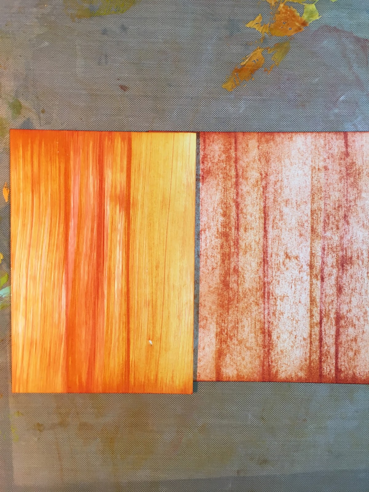
Initially, my problem was trying to find gloss card, as I knew the technique required a good quality high gloss. I managed to find two A5 sheets - not even A4!! Anyway, they did the job. The ink pads I used were Adirondack, which are a Dye felt ink pad.
First, apply the ink directly to the card, by wiping the pad over the top of the card;


Yesterday I showed a card I made years ago - way back in Topaz Crafts days!! Funny how some old techniques don't look dated. This technique is one that will be good for years.
Initially, my problem was trying to find gloss card, as I knew the technique required a good quality high gloss. I managed to find two A5 sheets - not even A4!! Anyway, they did the job. The ink pads I used were Adirondack, which are a Dye felt ink pad.
First, apply the ink directly to the card, by wiping the pad over the top of the card;


Next just spritz with water

You can either leave it to dry naturally, or blast it with a heat gun. The type of heat gun you use will give you a different effect. If you use a strong heat tool, you will move the water, and "chase the drip". It looks good, but will create "veins" of ink. Alternatively use a slow heat tool:

The next technique is streaking the ink over the card again, this time I've used two different colours, and then just used a tissue or sponge to blend the ink


I love how it looks, as you still get the streaks of colour, but the inks blend slightly to give a perfect finish. You can shine the card with a soft cloth to get the shine of the gloss card to pop

I wanted to show you how the exact same technique looks like if you use uncoated card stock. So, I've applied the ink directly to the card

Spritzed it with water, and then dried it with the heat gun

It gives you a completely different look - literally just depending on the type of card you use

See, when you hold them up next to each other, you can see how dramatically different the results are!

Now, I've tried the same technique with the two different colours

Again, I just used a cloth to blend the ink. Look at the difference! Precisely the same technique
Now I've overstamped onto my backgrounds, again to show you how different these look. Beautiful stamp again isn't it.

Okay, I decided to use the bottom left card, to make into a proper card. I took a piece of patterned paper, and over stamped, using the Adirondack ink to bring the colour into the background.

I then stamped a vine up the side

And popped my main image on, together with a sentiment, to see how they look

I used the same paper to stamp a flower and a swirl

And then inked a little blue onto the flower and swirl

and then blended in a little of the Adirondack

I laid the elements on, again to see if I was happy. Keep doing this to check on the progress of your work

I wanted to glaze my flower, and used my versamark pad, with clear embossing powder. When the first layer was melted, but still hot, I sprinkled a little gold embossing powder, and then clear powder over the top, and heated. The clear over the gold, breaks the gold up, which I hope you can see from the picture. It's subtle, but looks effective.

I then covered the sentiment with versamark, and clear embossing powder

Check again, to see what it looks like

And then assemble.

I added words, as the sentiment says we are the hero of our own story, so I wanted little extra words, that may make up that story

I hope you like it! Tomorrow has to be a quick post - as it's party time (sore throat, or no sore throat, the party must go on) xx

Tuesday 29 December 2015
50 days to go!
Sorry, I'm rather late with this post as well - I have excuses. First, I had to drive back to Peterborough from my mums, and spookily enough I set off later than planned. Second, I feel as rough as a piece of moldy burnt toast :) I'll be right, think it's just a bit of a cold, but urgh, rough. So a quick post it will be.


Now, I know it's glossy card, I'm almost positive it's Adirondack ink pads, which I've spritzed with water - but I'm not 100% sure. This was in the days before distress inks - I know, there were those days!! Because my memory is failing me, I'm going to set myself up a challenge, and attempt to re-create this background tomorrow so I can show you precisely how it was achieved - fingers crossed. I will show the experiments and the results, at any rate.

You know last week when i did the throwback card? Well, I'm doing it again, and look:
Same stamp, but different! I said this was one of my favourite stamps - and by Jove I have a card made with the original. This one is from Hampton art, and was a beautiful wood mounted stamp. I think it's striking. Due to the image being so strong, very little else is needed on the card, so I've just worked on a background:
I hope you like the card, and will join me tomorrow for an inky play
Cutting this one fine!!!
I'm going to have to type fast in order to get this posted before the clock strikes 12 and I turn into a frog.
So, I have 51 days left. That sounds like ages, but the days fly by so quickly, and the to-do list doesn't seem to go down. Time management was never my strong point. However, I have managed to do a blog post, so that's good going I think.
Today, I used Hobby Art Stamps again. My mum said, "ow, have you used a little house stamp". Yep mum, they're your stamps. Haha.
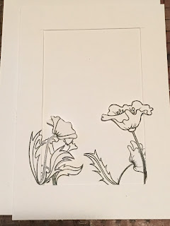
The stamps are called Poppy Scene-it CS044D - just in case you definitely need them (you do, they're lovely).
I started by stamping the two largest poppy stamps on a piece of plain white card, with a large space in between. My plan is, these stamps will form a frame, so therefore they need to be the largest image, as they will be the most prominent.


So, I have 51 days left. That sounds like ages, but the days fly by so quickly, and the to-do list doesn't seem to go down. Time management was never my strong point. However, I have managed to do a blog post, so that's good going I think.
Today, I used Hobby Art Stamps again. My mum said, "ow, have you used a little house stamp". Yep mum, they're your stamps. Haha.
The stamps are called Poppy Scene-it CS044D - just in case you definitely need them (you do, they're lovely).
I started by stamping the two largest poppy stamps on a piece of plain white card, with a large space in between. My plan is, these stamps will form a frame, so therefore they need to be the largest image, as they will be the most prominent.

I then cut out an aperture, cutting around part of the stamped images


Next I needed to stamp the layer which will sit behind this frame. I had to calculate where I needed the stamped images to sit. I used the acetate sheet to help me figure out where the image will look good, and then I added a pencil mark to remind me where I'm going to stamp


To also help me decided where I'm going to stamp, I'll keep the frame in situ, and then hover the stamp over the image, so see if it looks good. Then I whip the frame away and hope I manage to get the stamp in the position I planned!


I then sat the frame over the top, and then cut the aperture out again, along with the poppies


Next is to plan the background. I stamped my lovely little house, with grass, and hills. Then also cut this out


Viola

Next are the hill. I didn't just want to repeat the hills, so added some "plain" hills with my drawing pen. Then, you got it, cut out the hills


And now for colour. I put the sun in first. Actually, I made it way to big!! And then after I had to take some of the colour out and put the sky over it

I used water colour pencils. I just scribbled different shades onto the card, and then worked the colours together using a water brush

I used my distress ink on the frame, which I just swiped across the card using the edge of the ink pad. This gives a "wood" effect. I gently blended the ink into the card

I then glued the layers together. I used 3D foam for the top two layers, the bottom layers I just used 3D foam on the edges.

Black card frames my image, and a little glitter gel pen. I also used Glossy Accents on the poppies, just to make them really stand out


I think I like it. However, I may take some of the colour off the hills, and maybe I'll add a little ink on the edges of the leaves to cover up the white. Or, alternatively, I won't faff anymore, as it's already really late, and as a frog, I am now finding it very difficult to type :)
Subscribe to:
Posts (Atom)